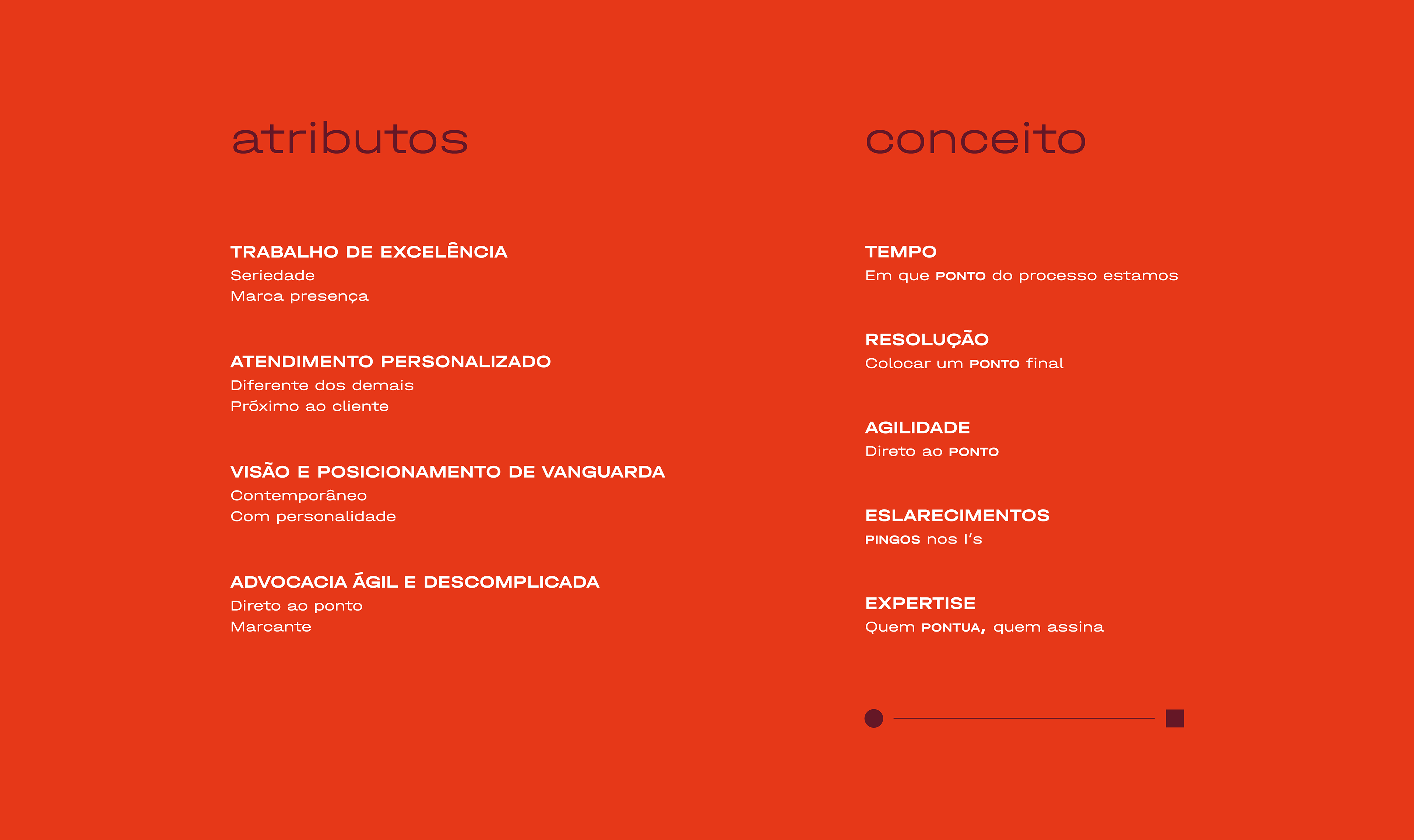
The visual identity was developed based on a branding study that identified the firm's key attributes: excellence in work, personalized service, a forward-thinking vision and positioning, and agile, straightforward legal practice.
From this foundation, the concept of the "point" was developed. It symbolizes questions like: At what point are we in the process?, Let’s put a full stop, Get straight to the point, Dot the i's and cross the t's.
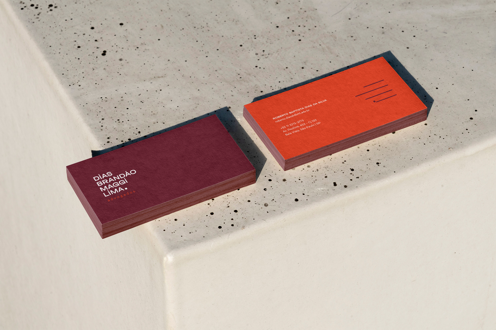
To complement the concept, a friendly typography and vibrant colors were chosen. In addition, a graphic element was created from the logo, referencing the company's expertise and the signature of those behind the business.